Show Open
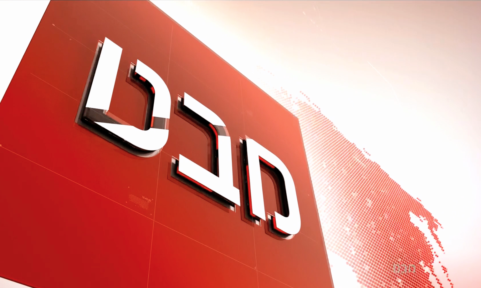
A 30 second show open takes the viewer through a riveting exploration of the new virtual studio folded into the new logo type and highlighted in bright red capturing the immediacy of on-air news reports.
Logo Update
We've updated the logo and all its components balancing lighter typography set against a wonderfully intricate backdrop of the world, symbolizing the ability of the popular news show to convey complex world affairs in a simple language understood by all.
Internal Graphics
The show's internal graphics are very clean in comparison and were designed to allow the news to shine while taking a visual backseat to the story.
Election 2015 Graphics
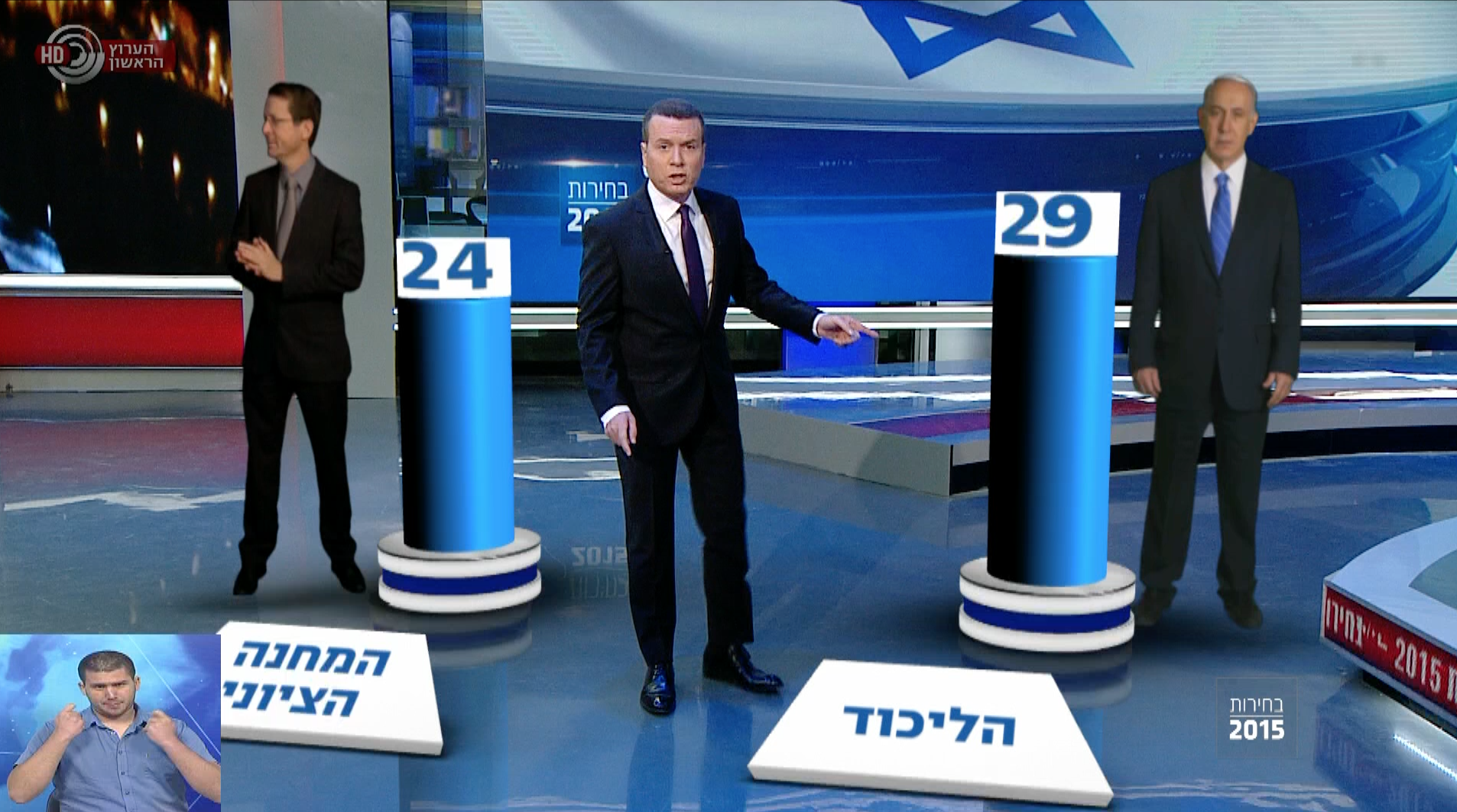
The graphics package for the election required an inverted approach whereby blue on-air design served to cool off and balance the typical campaign drama.


